Arctic Monkey Band Redesign:
A staple of 2000’s rock, reimagined.
Why the Monkeys?
The Arctic Monkeys, a British rock band formed in 2002, have had a profound impact on the music industry with their distinctive sound blending indie rock and post-punk influences. After seeing them live in London, they quickly became one of my favorite bands. With an almost non-existent consistent branding at the time, they felt like the perfect band for the project.
Previous Album
Project Overview:
The project assignment was simple; take an existing band and design various elements of a tour for an album. We needed to take the elements of the album and the band and visually communicate it with the products we created. We also had to pick two styles to merge that we were going to create our design with.
Redesigned Album
The initial concepting phase was what I considered to be the most challenging. Coming from a fine art background really showed me that I did not have the design process instilled in my thought process. When starting from scratch I had to ask myself:
“What defines the Arctic Monkeys, and how can I show that without saying any words?” and “How am I going to put my personal touch into this? How is this also me?”
These questions then began to guide my thought process when creating the mood boards and style guides.
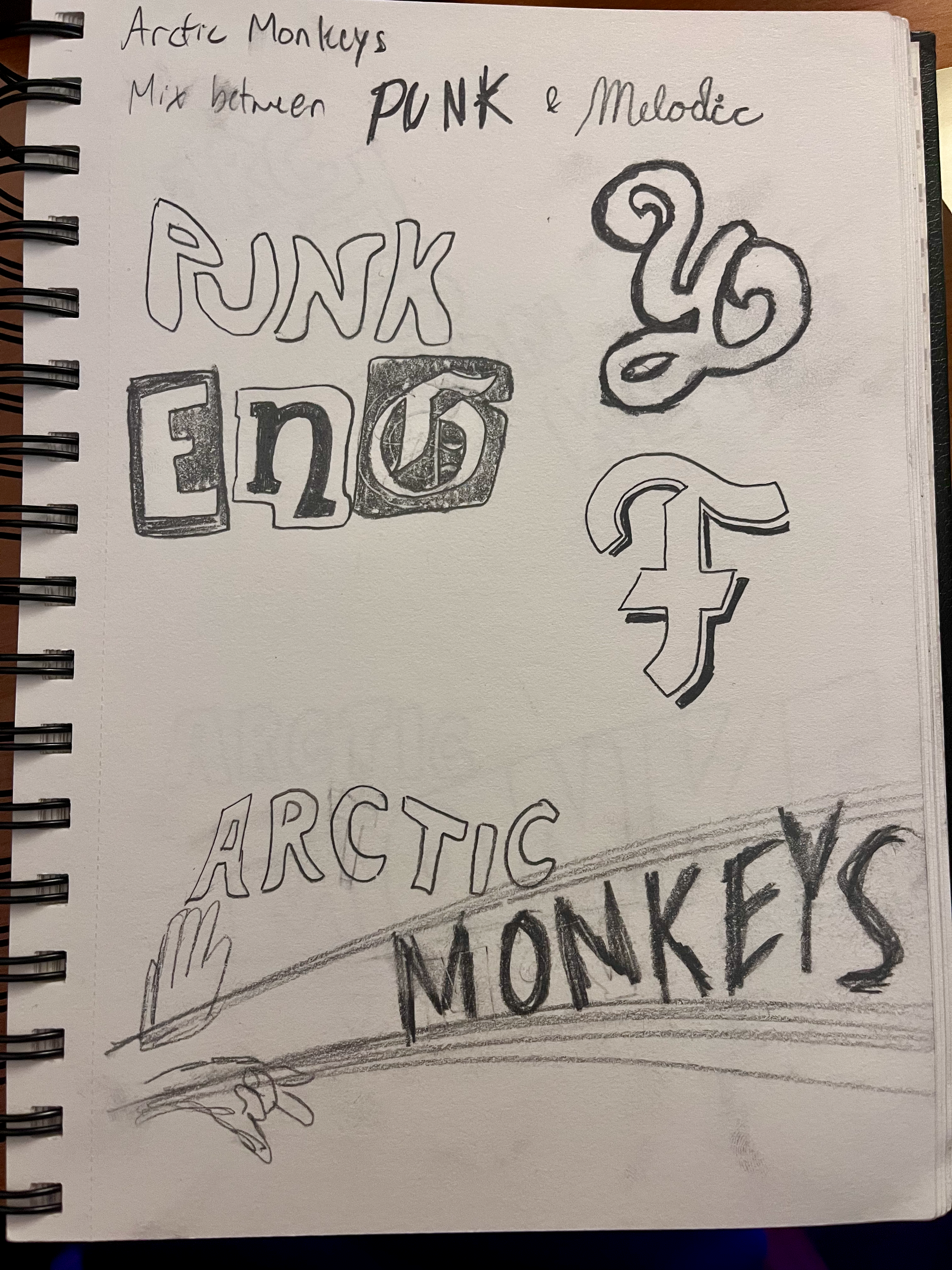
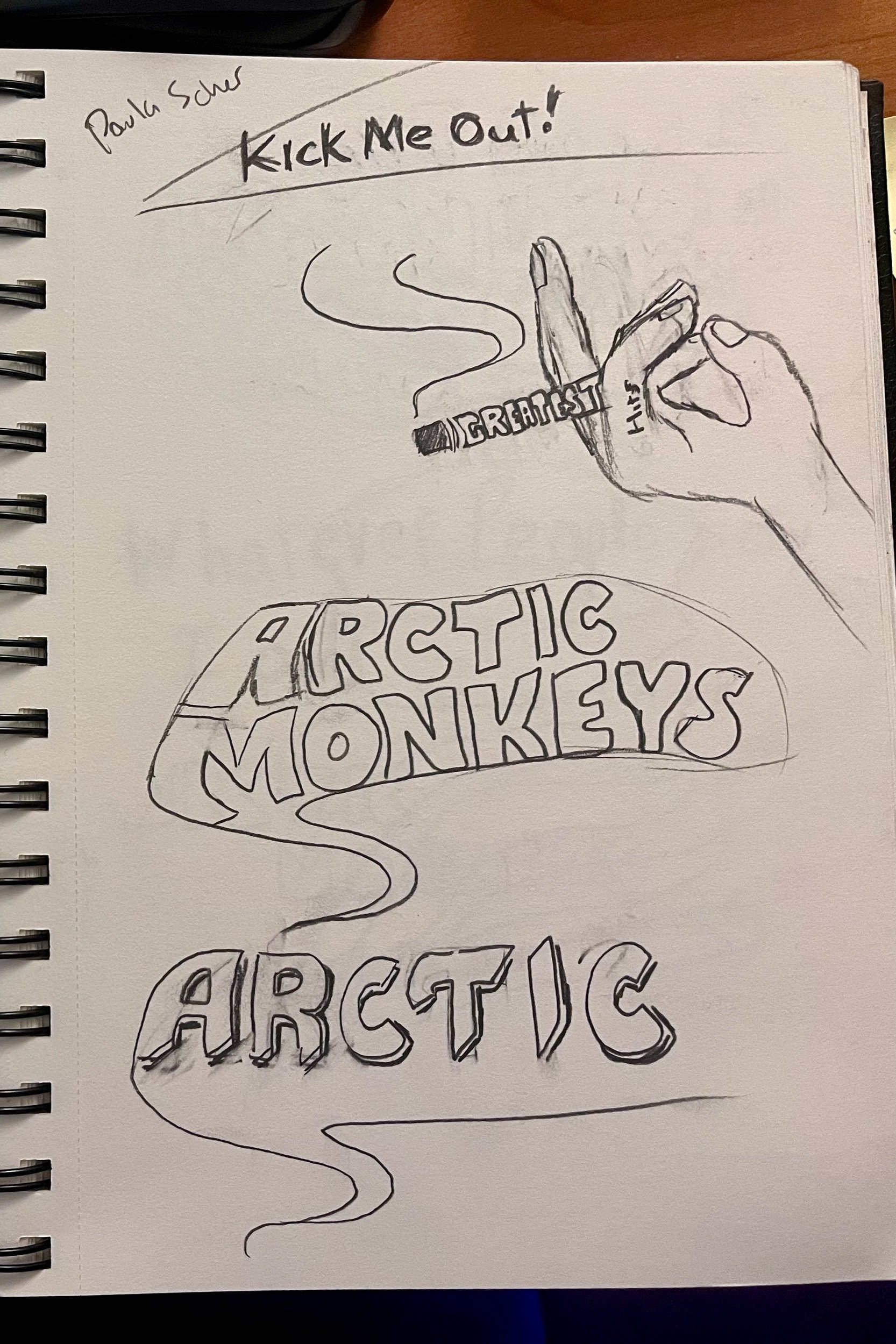
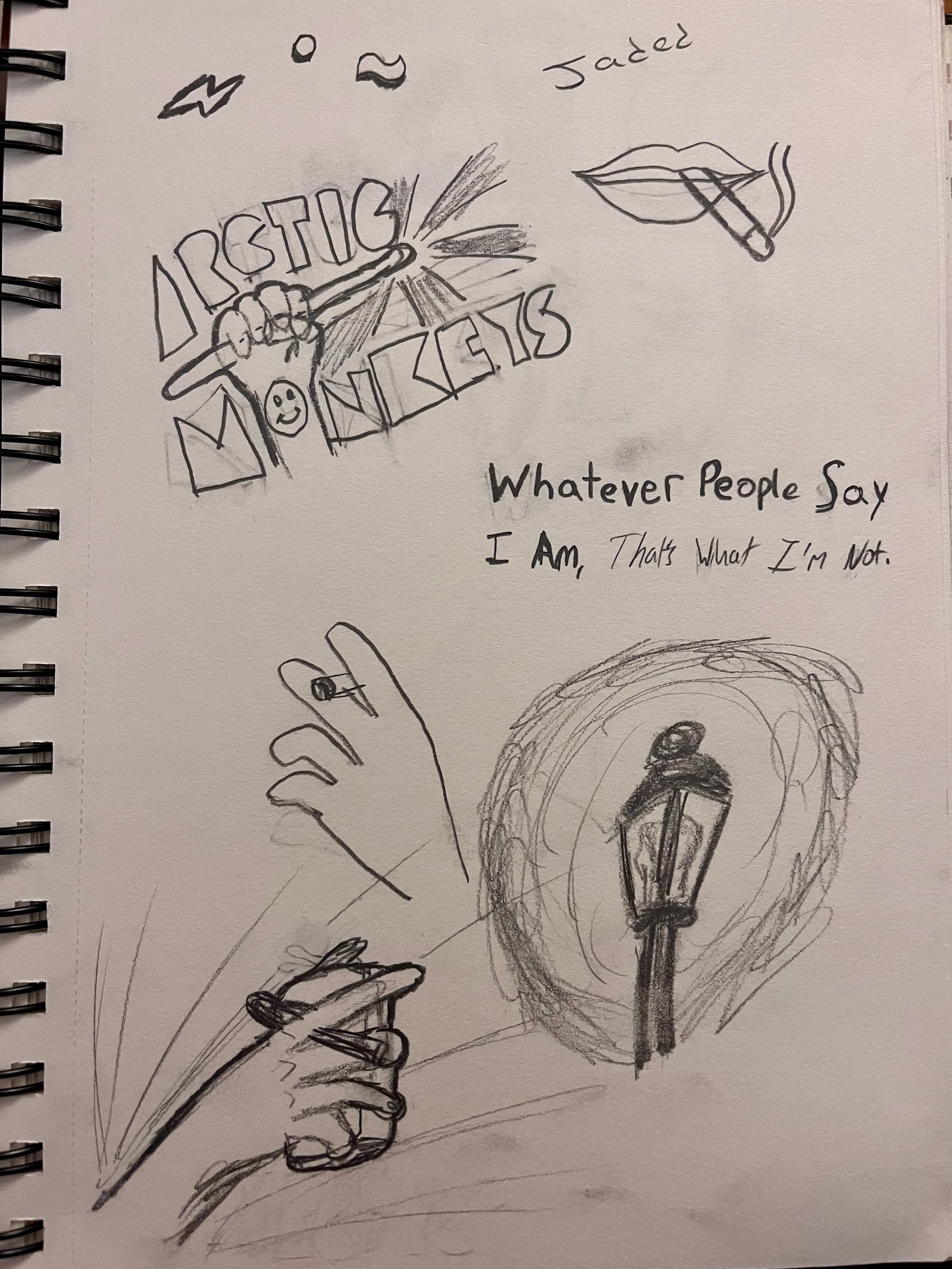
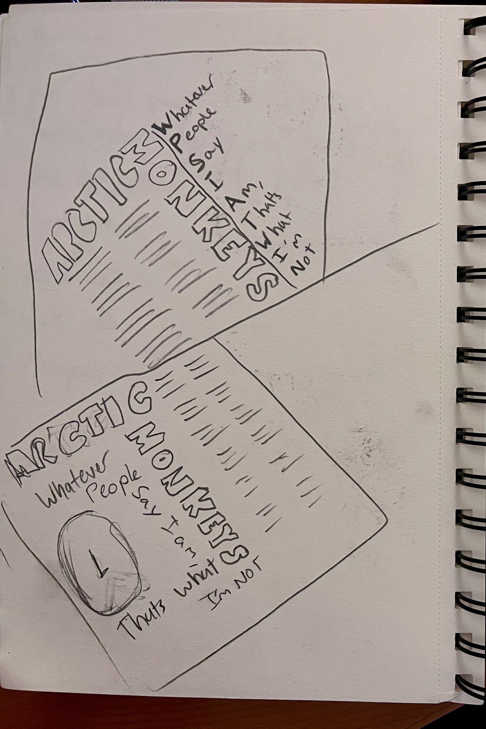
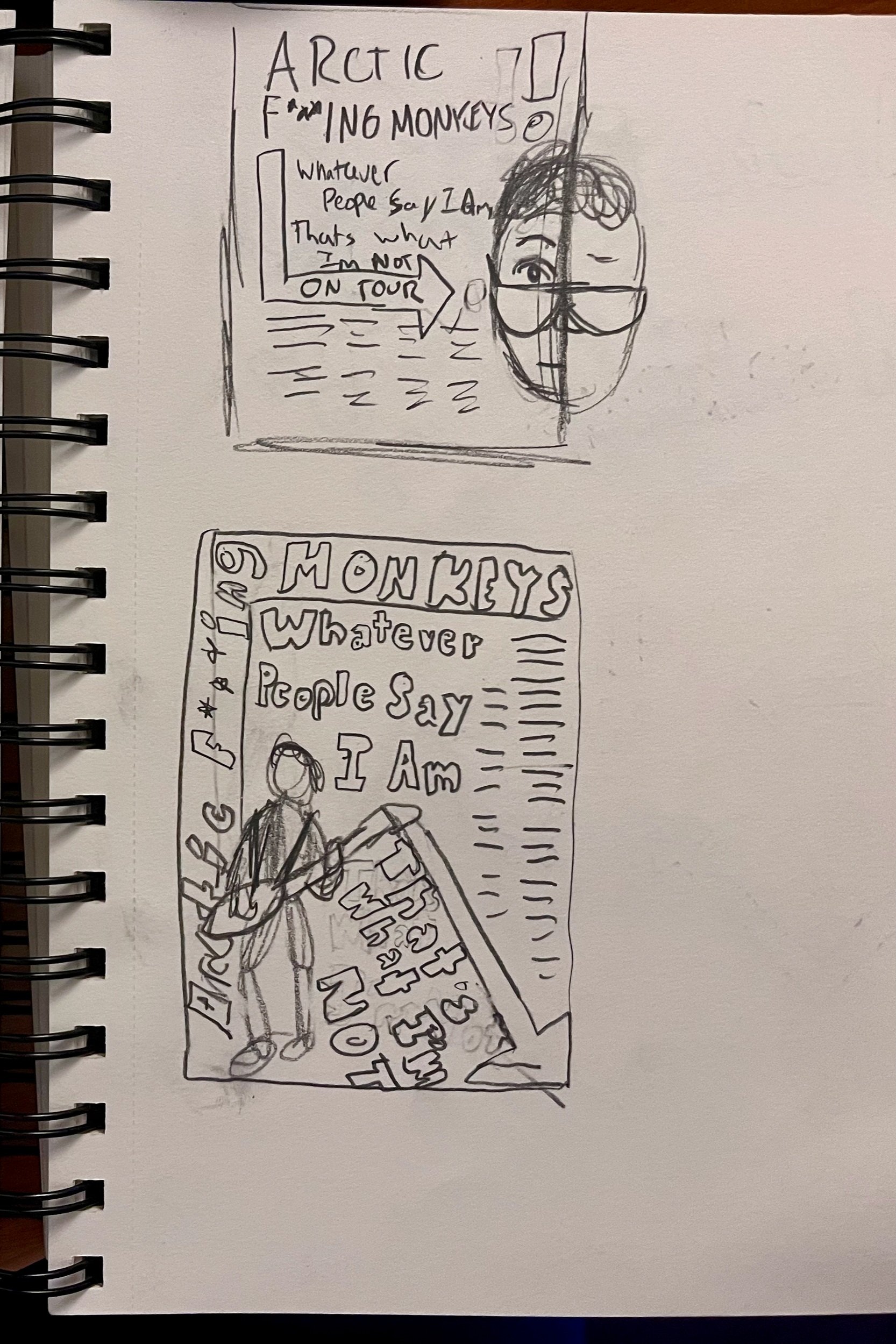
Initial Concepting and sketching:
During the concepting phase, I finalized the two concepts I was going to merge. I went with Garage Rock Deconstructivism. The idea was to keep the same aesthetic of indie rock that is at the root of this album, while also meshing it with the visually askew grids of the Russian constructivism movement.
The art style of the band Franz Ferdinand did inspire my thought process, so I attempted to stray from it outside of the concepting phase.
Mainly, I wanted to visualize the stories that were told throughout this album, which are about an average night out in Britain.
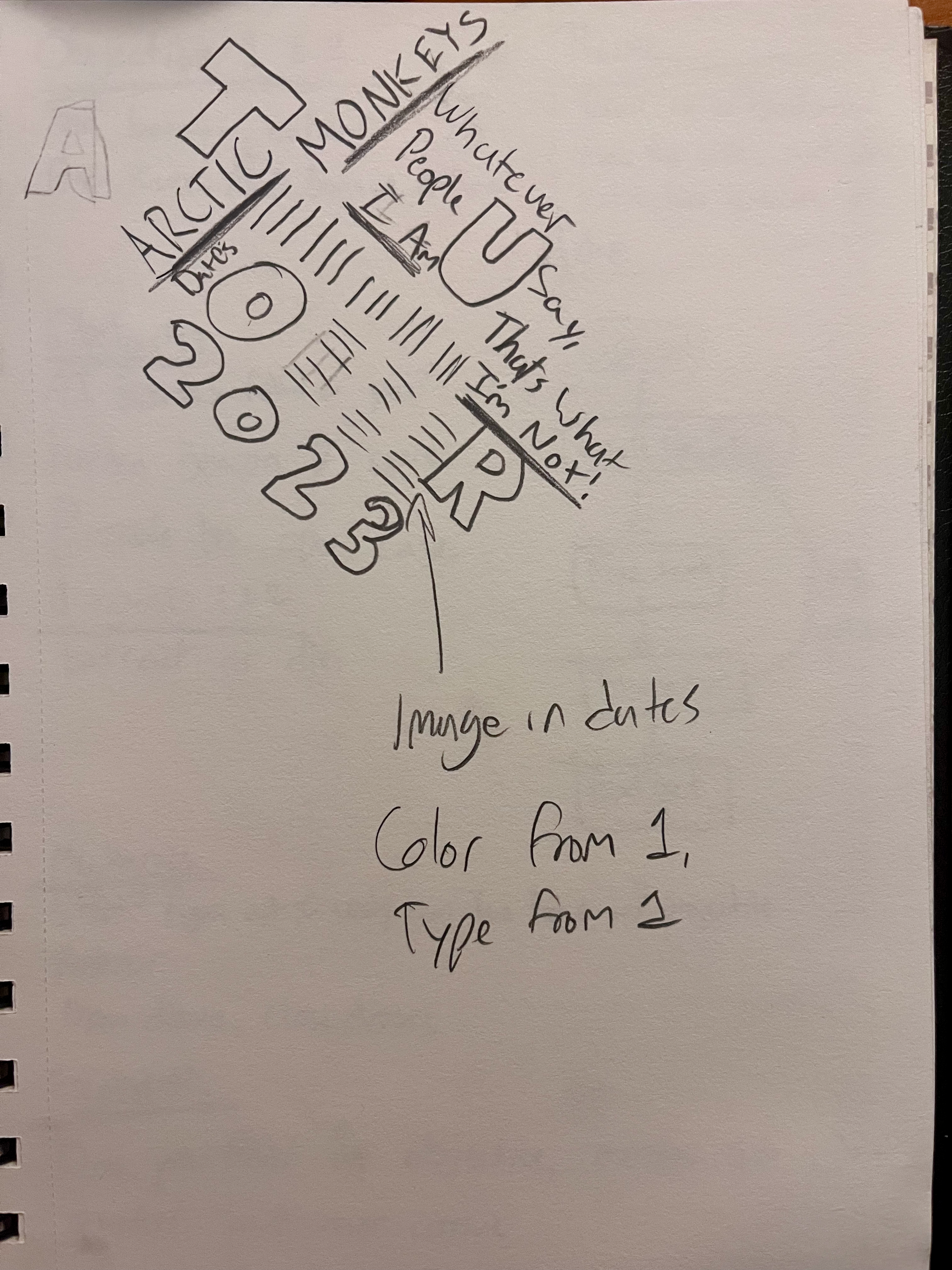
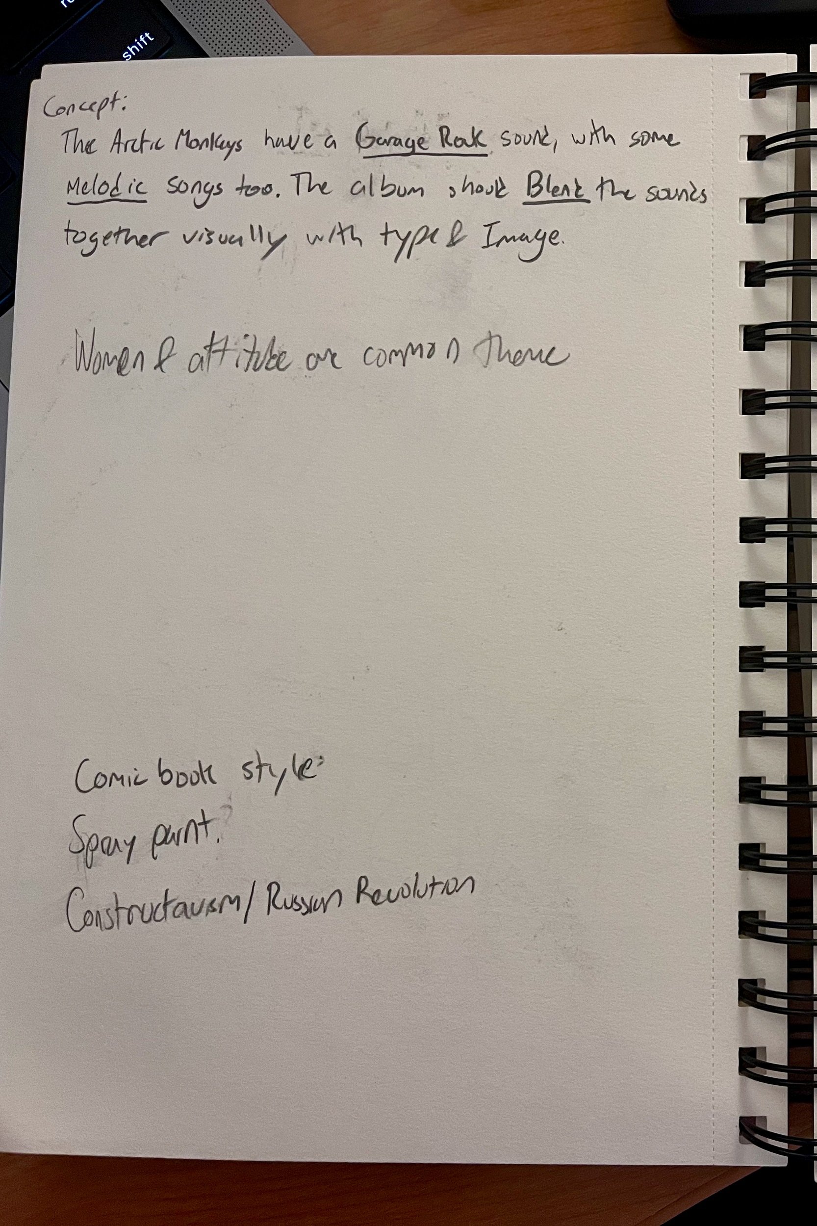
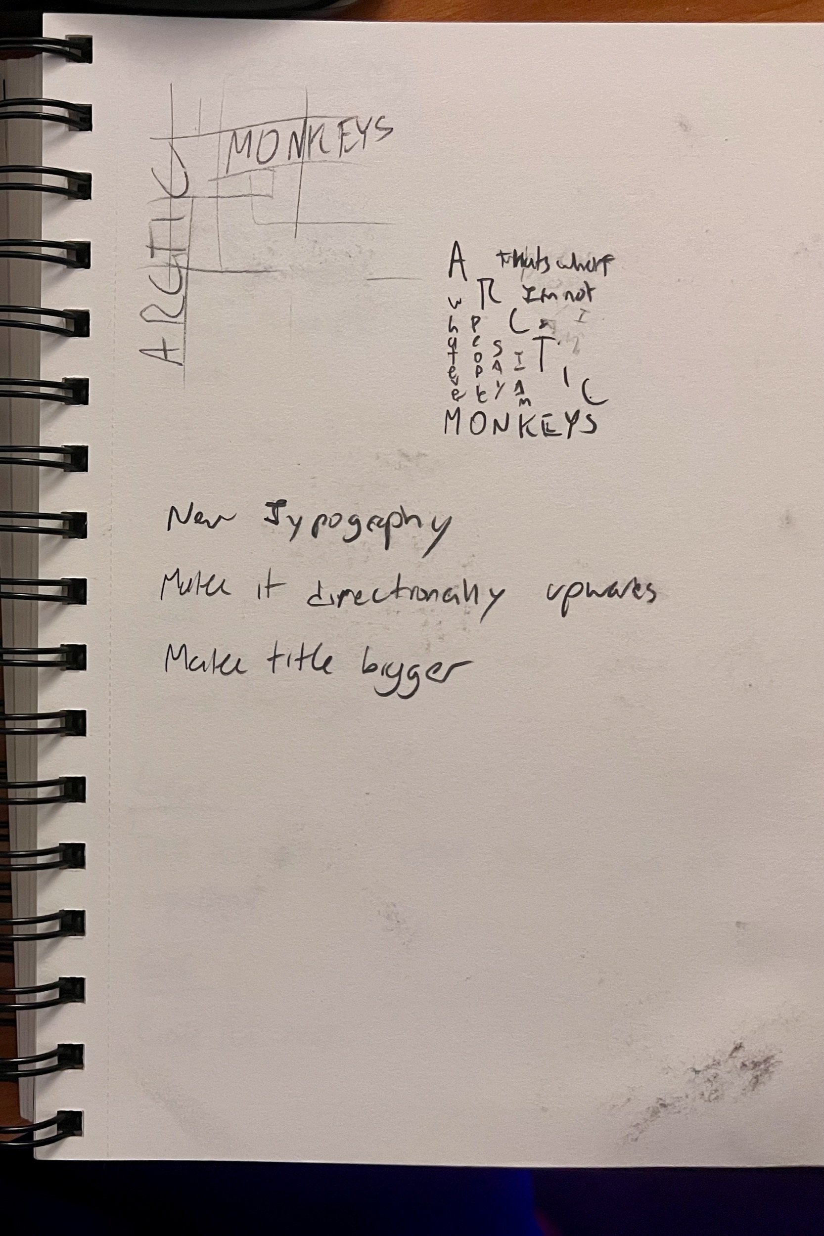
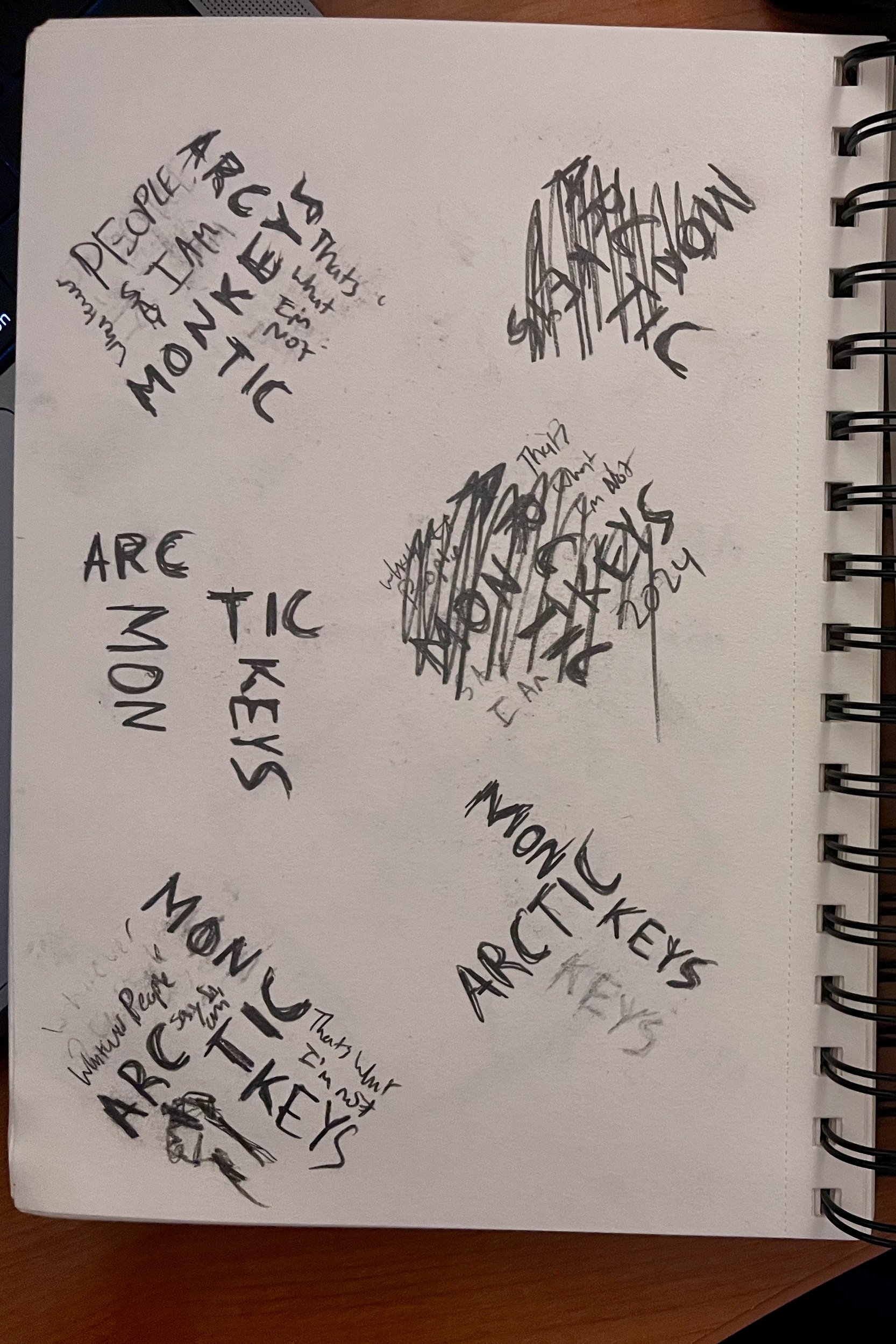
Deliverables
Poster:
The first design I was tasked with creating was a tour poster. The poster needed one image, the band, all of the dates, and the album name.
The back features a dirty pattern, which was inspired by all of the band posters I would see tattered up on the walls in my trip to London.
The most difficult part of this poster was emphasis on hierarchy. It taught me an important lesson on identifying the most important part of the image. In this case, it is the band name. Second is the album name, and third is the US TOUR. The dates are last, tucked as informational text as well as an integrated part of the design.
Album Cover:
After the poster, I moved on to the album cover. This was my favorite design of the batch. In this one, instead of going with the grid, I decided to use the font as the “deconstructivism”, as the reason I chose it was for its deconstructed quality. I placed it front and center with a reflection, and really liked how it meshed well with the background. This was not a sketched design, it was a product of playing around with the designs I had on hand.
Social Media Advertisements:
These social media advertisements were created using Figma and designed to be posted to an Instagram page for various concerts in March. These designs follow the imagery and themes present in the album and poster.
Spotify Animation:
The Spotify animation was the last project to be made and was an introductory learning experience for me. It was made in Adobe After Effects, which I had minimal experience with. The hands’ movement on either side gives the illusion of two drunk people yelling at each other in a bar. The adlibs that come across the screen, “Kick Me Out!” are from the song “Fake Tales of San Francisco” on the album.
What I’ve Learned:
Creating a band redesign from the ground up was a huge challenge for me. As I went through the process, I learned that capturing the ideas and core values of a group and visually communicating them is a puzzle that requires many small, minute choices.
Beyond the concepting, creating the physical products was a lesson in itself. I spent many nights working with the upperclassmen in my program learning about hierarchy, color choice, font choice, and composition. They are all integral parts of a project that come together to form one cohesive collection.
I also learned how to not cling onto an idea too hard. I had plenty of ideas in this project that I loved personally but did not fit into the theme, or did not pan out like I thought they would in my head, and getting outside feedback from my peers really helped me see that.
Overall, what I learned from this project was the most valuable part of creating it.


